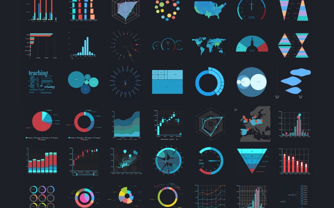
DATA VISUALIZATION – PRESENTING INSIGHTS FROM DATA
29 June 2021 – Online Livestream via Zoom
Participants are required to bring their laptops with MS Excel (ver 2010 or later)
This workshop aims to provide a broad but practical overview of the entire analytics value chain; with a specific focus on presenting data to convey the right message to an audience. Attendees will learn the fundamentals of visualization and get their hands “dirty” building different visualizations with large data sets. This is targeted at professionals and managers in non-analyst roles but may be required to work with or make sense of data and presenting data in their work.
Key Benefits:
• Understand what data analytics is, and the key ingredients for sustainable analytics
• Understand the analytics value and the part that effective communications with data plays in delivering the “last mile” of value
• Appreciate the thought process as well as key technical and visual considerations to designing effective data visualizations
• Appreciate the thought process as well as key technical and visual considerations to assembling data visualizations into coherent and impact dashboards
• Gain exposure to various analytical and visualization techniques and tools to glean insights from the data
Who Should Attend?
This workshop is designed for managers, professionals and staff at all levels who want to learn make a bigger impact with their analysis. The course is suitable for participants across all industries and job functions. Participants are required to have basic MS Excel skills; some prior knowledge of data analytics would be helpful.

